
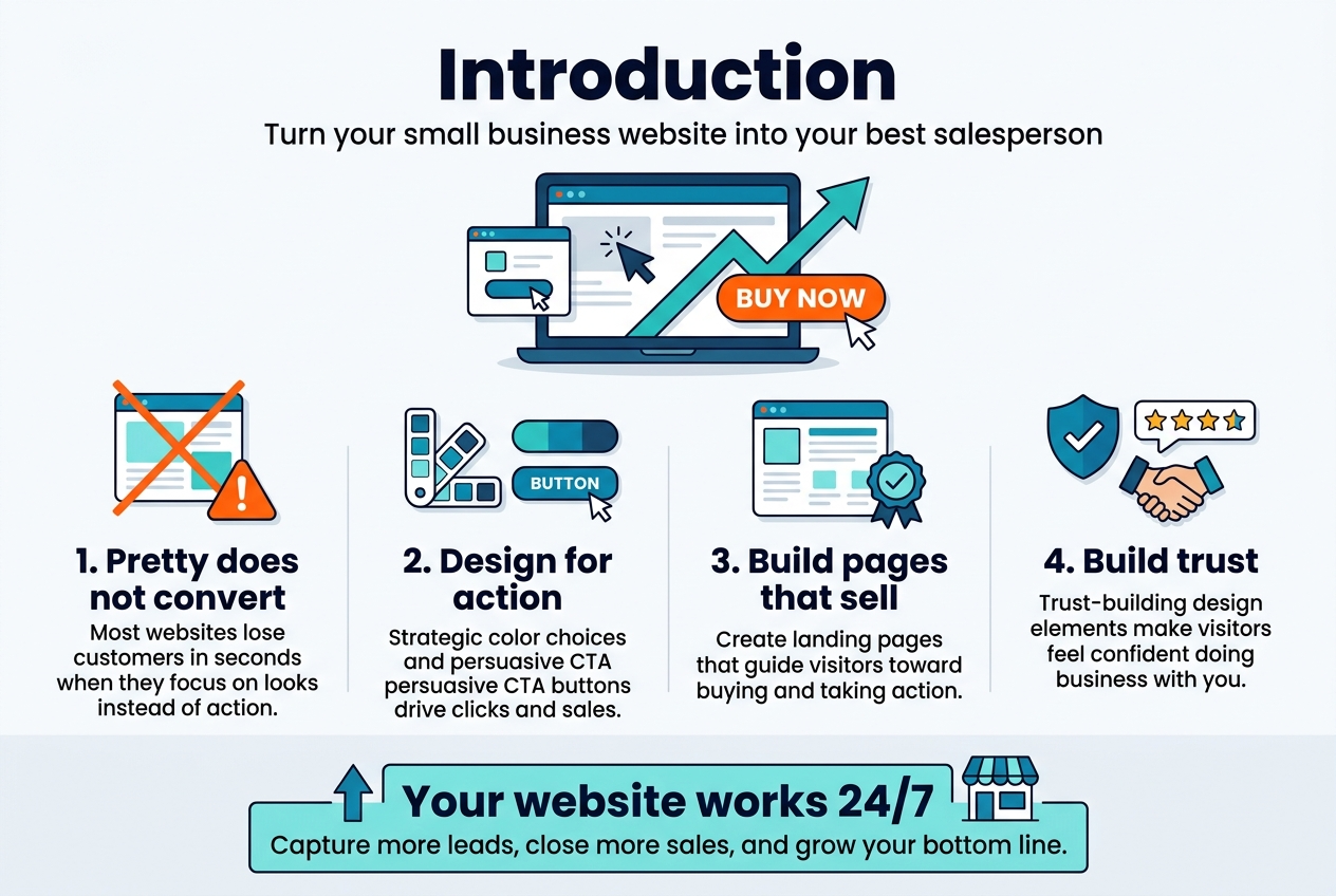
Your small business website should work as your best salesperson—turning visitors into paying customers around the clock. This complete guide shows small business owners, entrepreneurs, and marketing professionals exactly how to create website design that converts browsers into buyers in 2026.
Most small business websites lose potential customers within seconds because they focus on looking pretty instead of driving action. Conversion-focused design changes that. When you understand what makes visitors click “buy now” instead of clicking away, you can transform your website into a powerful revenue generator.
We’ll walk through the essential design elements that actually boost conversion rates—from strategic color choices to persuasive call-to-action buttons that get results. You’ll discover how to create compelling landing pages that sell your products and services, plus learn the trust-building design elements that make visitors feel confident about doing business with you.
By the end of this guide, you’ll have a clear roadmap for optimizing your small business website design to capture more leads, close more sales, and grow your bottom line. Let’s turn your website into your hardest-working employee.
Understanding Conversion-Focused Website Design Fundamentals
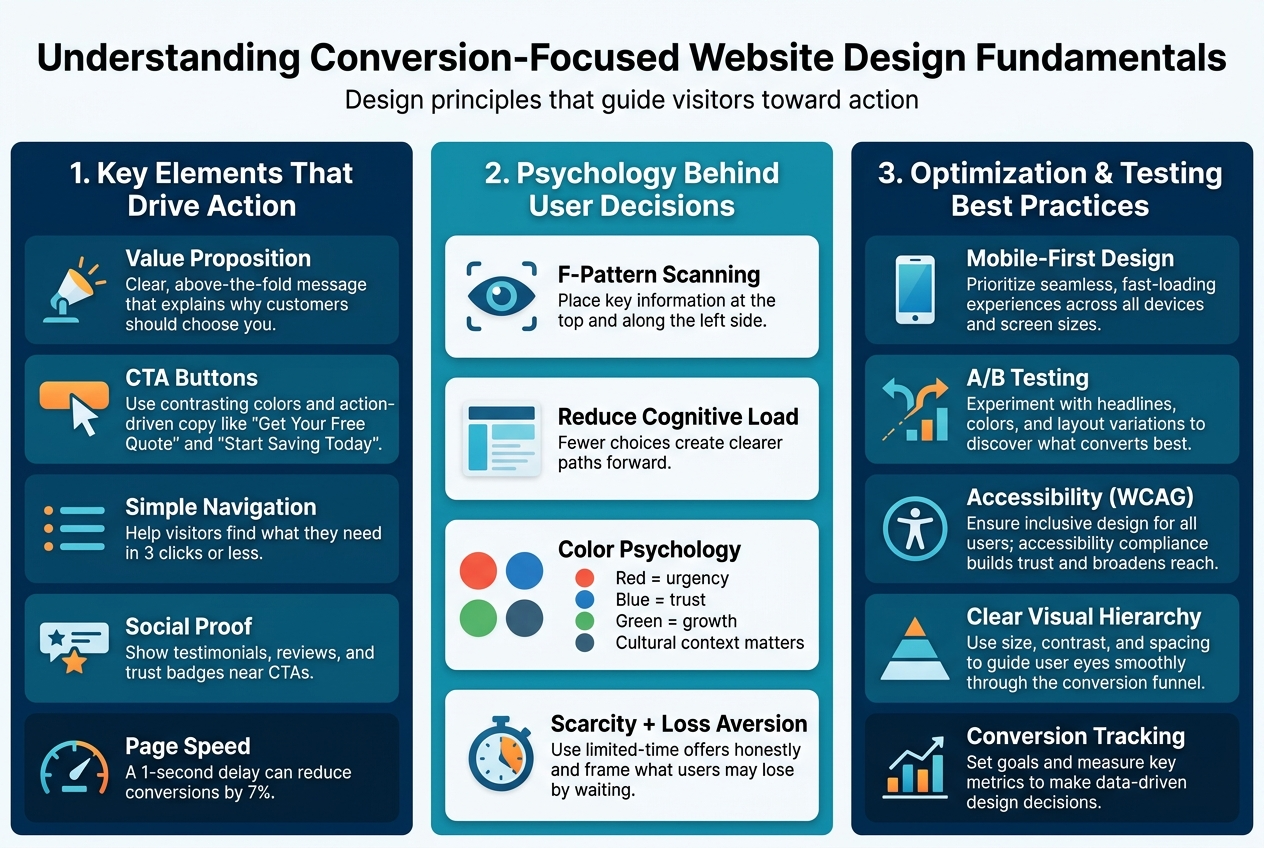
Key Elements That Drive Customer Action
Conversion-focused design centers on specific elements that guide visitors toward taking meaningful actions on your website. The most powerful component is your value proposition – a clear statement that explains what makes your business unique and why customers should choose you over competitors. This message needs to appear prominently above the fold, usually within the first few seconds of a visitor’s arrival.
Strategic call-to-action (CTA) buttons serve as the bridge between interest and action. These buttons work best when they stand out visually through contrasting colors and compelling copy that creates urgency. Instead of generic phrases like “Submit” or “Click Here,” use action-oriented language such as “Get Your Free Quote” or “Start Saving Today.”
Website navigation plays a crucial role in conversion optimization. Visitors should find what they’re looking for within three clicks maximum. A cluttered or confusing menu structure creates friction that sends potential customers away. Smart small business website design includes intuitive pathways that lead users naturally toward conversion points.
Social proof elements like customer testimonials, reviews, and trust badges significantly impact visitor confidence. When people see that others have had positive experiences with your business, they’re more likely to take action themselves. Display these elements strategically near your main CTAs for maximum impact.
Page loading speed directly affects your bottom line. Research shows that even a one-second delay in load time can reduce conversions by 7%. Optimizing images, choosing reliable hosting, and minimizing unnecessary plugins keeps your site running smoothly and keeps visitors engaged.
Psychology Behind User Decision-Making
Understanding how people make decisions online gives you a significant advantage in creating website design that converts. Visitors typically scan web pages in an F-pattern, focusing first on the top of the page, then scanning down the left side. This natural reading behavior means your most important information – including your main value proposition and primary CTA – should align with this pattern.
The principle of cognitive load explains why simple designs often outperform complex ones. When visitors encounter too many choices or overwhelming amounts of information, they experience decision paralysis and often leave without taking action. Successful conversion-focused design removes unnecessary distractions and presents clear, focused paths forward.
Color psychology influences user behavior more than many business owners realize. Red creates urgency and excitement, making it effective for limited-time offers. Blue builds trust and professionalism, ideal for service-based businesses. Green suggests growth and prosperity, perfect for financial services. However, cultural context matters – what works for one audience might not resonate with another.
The scarcity principle drives action by creating a fear of missing out. Limited-time offers, countdown timers, or statements about low inventory levels can motivate hesitant visitors to act quickly. Use this technique honestly and sparingly to maintain credibility with your audience.
Loss aversion psychology suggests that people hate losing something more than they enjoy gaining something of equal value. Frame your offers to highlight what customers might lose by not acting, rather than only focusing on what they’ll gain.
Mobile-First Design Principles for Maximum Impact
Mobile devices now account for more than half of all web traffic, making mobile-first design essential for small business web design in 2026. This approach means designing for mobile screens first, then scaling up to larger devices, rather than the traditional desktop-first method.
Touch-friendly design elements prevent user frustration and improve conversion rates. Buttons and clickable areas should be at least 44 pixels in size, with adequate spacing between them to prevent accidental taps. This seemingly small detail can dramatically improve user experience and reduce bounce rates.
Simplified navigation becomes even more critical on mobile devices. Hamburger menus work well when clearly labeled, but consider showing your most important pages directly in a visible menu bar. Users shouldn’t have to hunt for basic information like contact details or service offerings.
Mobile page speed requires special attention since mobile connections can be slower and less reliable than desktop connections. Compress images specifically for mobile viewing, minimize the use of large graphics, and consider implementing Accelerated Mobile Pages (AMP) for content-heavy pages.
Thumb-friendly design acknowledges how people actually hold and use their phones. Place important buttons and CTAs in the natural thumb zone – the area easily reached by a thumb while holding a phone one-handed. This typically means avoiding placement at the very top or bottom edges of the screen.
| Mobile Design Element | Impact on Conversions | Best Practice |
|---|---|---|
| Button Size | +25% tap accuracy | Minimum 44px |
| Load Speed | +12% completion rate | Under 3 seconds |
| Text Size | +18% readability | Minimum 16px |
| Form Fields | +30% completion | One column layout |
Mobile forms deserve special consideration since they’re often the final step in the conversion process. Use smart input types that bring up appropriate keyboards (numeric for phone numbers, email for email addresses), minimize required fields, and consider implementing autofill capabilities to reduce typing on small screens.
Essential Design Elements That Boost Conversion Rates
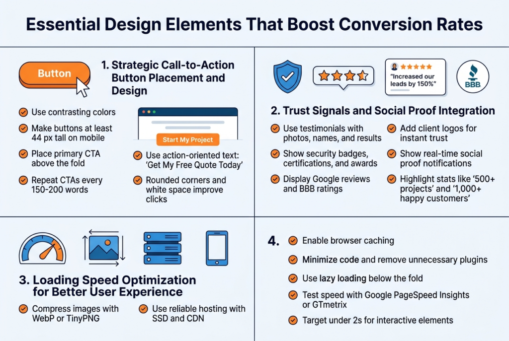
Your call-to-action buttons make or break your website’s conversion rate. The best CTAs stand out visually while feeling natural in the user’s journey. Use contrasting colors that grab attention without clashing with your brand – if your website uses blue tones, try orange or red buttons. Size matters too: buttons should be large enough to click easily on mobile devices, typically at least 44 pixels in height.
Position your primary CTA above the fold on every page, and repeat it strategically throughout longer content. The rule of thumb is placing CTAs after every 150-200 words of content. Your button text should create urgency and clearly state the benefit: “Get My Free Quote Today” beats “Submit” every time.
Test different button shapes – rounded corners often perform better than sharp edges because they feel friendlier. Don’t forget about white space around your buttons; cramped CTAs get ignored. For small business website design, consider using action-oriented verbs that match your industry: “Schedule Consultation,” “Start My Project,” or “Claim Discount.”
Trust Signals and Social Proof Integration
Trust signals turn skeptical visitors into confident customers. Customer testimonials work best when they include photos, names, and specific results. Instead of generic praise like “Great service!”, showcase testimonials that mention actual outcomes: “WebDesign Pro increased our leads by 150% in just three months – Sarah M., Local Restaurant Owner.”
Display security badges, certifications, and awards prominently near your contact forms and checkout areas. Google reviews, Better Business Bureau ratings, and industry certifications build credibility fast. Client logos create instant recognition and trust, especially if you’ve worked with well-known local businesses.
Real-time social proof works wonders too. Show recent customer activity with notifications like “John from Denver just requested a quote” or “5 businesses signed up today.” Numbers speak volumes – if you’ve completed 500+ projects or served 1,000+ happy customers, flaunt those statistics.
Media mentions and press coverage deserve prime real estate on your homepage. Even local newspaper features or podcast appearances add authority to your small business web design services.
Loading Speed Optimization for Better User Experience
Page speed directly impacts your conversion rate – every second of delay costs you customers. Websites that load in under 3 seconds convert significantly better than slower ones. Start by compressing your images using tools like TinyPNG or WebP format, which can reduce file sizes by 80% without visible quality loss.
Choose a reliable hosting provider that offers SSD storage and content delivery networks (CDNs). Cheap hosting might save money upfront but kills conversions through slow loading times. Enable browser caching so returning visitors experience lightning-fast load times.
Minimize your code by removing unnecessary plugins and widgets. Every element on your page requires processing power. Use lazy loading for images below the fold – they’ll load only when users scroll down, dramatically improving initial page speed.
Test your website speed regularly using Google PageSpeed Insights or GTmetrix. Mobile speed matters even more since most users browse on phones. Aim for loading times under 2 seconds on mobile devices to maximize your conversion-focused design effectiveness.
Navigation Structure That Guides Users to Purchase
Smart navigation acts like a sales funnel, naturally guiding visitors toward your desired actions. Keep your main menu simple with 5-7 clear categories maximum. Too many options create decision paralysis and hurt conversions. Use descriptive labels instead of clever ones – “Services” works better than “Solutions” for most small businesses.
Create logical pathways that match your customers’ buying journey. Someone researching website design should easily find your portfolio, then your pricing, then your contact form. Breadcrumb navigation helps users understand where they are and how to backtrack without frustration.
Your homepage should answer three questions within seconds: what you do, who you serve, and why visitors should choose you. Use clear headlines and strategic internal linking to guide users deeper into your site. The goal is making the next step obvious at every stage.
Footer navigation often gets overlooked but plays a huge role in conversions. Include your most important pages, contact information, and trust signals in your footer. Many users scroll to the bottom looking for credibility markers before making contact.
Creating Compelling Landing Pages That Sell

Above-the-Fold Content That Captures Attention
Your website visitors make split-second decisions about staying or leaving based on what they see first. The above-the-fold section – everything visible before scrolling – needs to work harder than any other part of your landing page design. Think of it as your digital storefront window that either draws people in or sends them walking past.
Your hero section should instantly communicate what you offer and why someone should care. Skip the generic welcome messages and corporate jargon. Instead, lead with a clear value proposition that speaks directly to your visitor’s problem. A local bakery shouldn’t just say “Welcome to Sweet Dreams Bakery” – they should say “Custom Wedding Cakes That Make Your Special Day Unforgettable.”
Include a compelling visual that supports your message. This could be a professional photo of your product, a happy customer, or your team in action. Real photos of your actual business always outperform stock images because they build authentic connections with visitors.
Your primary call-to-action button deserves prime real estate in this space. Make it stand out with contrasting colors and action-oriented text like “Get Your Free Quote” or “Schedule Your Consultation.” Position it where eyes naturally go – typically the upper right area or center-right of your hero section.
Benefit-Driven Headlines and Persuasive Copy
Your headlines can make or break your website conversion tips strategy. Weak headlines focus on what you do; powerful headlines focus on what your customers get. “Professional Plumbing Services” is forgettable. “24/7 Emergency Plumbing – We Fix It Right the First Time” tells visitors exactly why they should choose you.
Create headlines that address specific pain points your customers face. If you’re a fitness trainer, don’t just say “Personal Training Available.” Instead, try “Lose 20 Pounds in 12 Weeks Without Giving Up Your Favorite Foods.” This approach immediately resonates with people who’ve struggled with restrictive diets.
Your supporting copy should expand on the promise in your headline. Use concrete numbers, specific outcomes, and real benefits that matter to your audience. A landscaping company might say: “Transform your backyard into an outdoor paradise in just 3 weeks. Our clients save an average of 4 hours per weekend on yard work while increasing their home value by $15,000.”
Write like you’re talking to a friend who needs your help. Avoid industry jargon and technical terms that confuse rather than clarify. Your small business website design should speak the same language your customers use when describing their problems.
Visual Hierarchy That Directs User Focus
Smart conversion-focused design guides visitors’ eyes exactly where you want them to go. Visual hierarchy isn’t about making everything big and bold – it’s about creating a logical flow that leads to action. Your most important elements should grab attention first, followed by supporting information, then your call-to-action.
Use size, color, and spacing strategically to create this flow. Your main headline should be the largest text element, followed by subheadings that break up information into digestible chunks. White space around important elements makes them stand out more than cramming everything together.
Color psychology plays a huge role in directing attention. Warm colors like red and orange create urgency, while blue builds trust. Use contrasting colors to make your call-to-action buttons pop against the background. A green “Get Started” button on a white background with blue accents creates clear visual separation.
Position elements based on how people naturally scan web pages. Most visitors follow an F-pattern – reading across the top, scanning down the left side, then reading across again. Place your most critical information along these natural eye-movement paths for maximum impact.
Form Design That Reduces Abandonment Rates
Long, complicated forms kill conversions faster than anything else on your website. Every field you add creates another opportunity for visitors to change their minds and leave. Start with the absolute minimum information you need to follow up with prospects, then gradually collect more details over time.
For most small business web design 2026 projects, name, email, and phone number are enough for initial contact. You can always gather additional information during your first conversation or through email follow-up. A roofing contractor doesn’t need to know someone’s home square footage, roof type, and budget before scheduling an estimate.
Make your forms visually appealing and easy to complete. Use single-column layouts that feel less overwhelming than multi-column designs. Include helpful labels inside form fields that disappear when users start typing. Add progress indicators for longer forms so people know how much work remains.
Smart form features can dramatically improve completion rates. Auto-fill suggestions speed up the process, while real-time validation prevents submission errors. If someone enters an invalid email format, let them know immediately rather than waiting until they hit submit. Consider using social login options like “Sign up with Google” to eliminate form-filling entirely.
Error messages should be helpful, not judgmental. Instead of “Invalid input,” try “Please enter a valid phone number like (555) 123-4567.” This approach guides users toward success rather than making them feel stupid for making mistakes.
Building Trust Through Professional Website Design
Credibility Indicators That Reassure Visitors
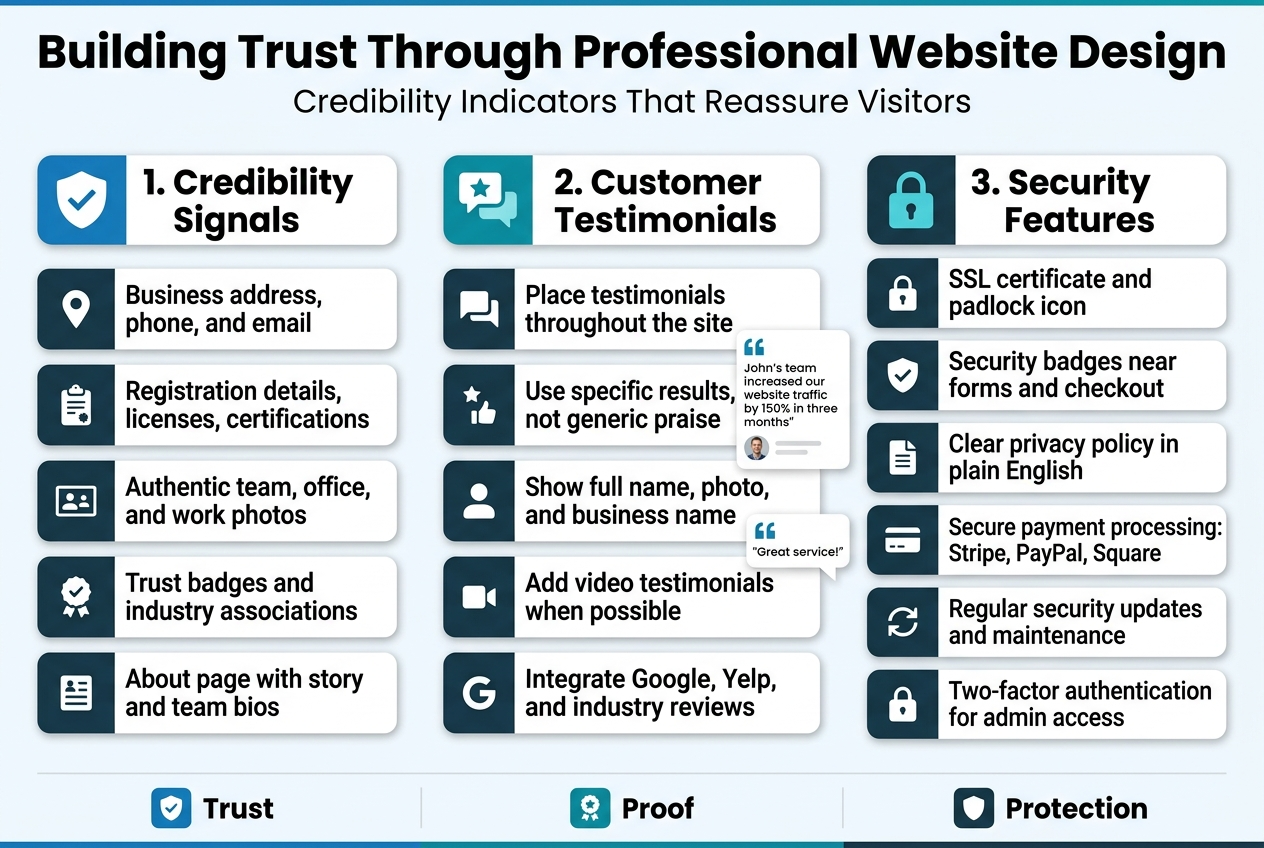
Your website needs to prove it’s legitimate within seconds of a visitor landing on your page. Professional website design for conversions starts with clear credibility signals that immediately put potential customers at ease.
Display your business address, phone number, and email prominently in your header or footer. Real businesses have real locations, and hiding contact information sends red flags. Include your business registration details, licenses, and certifications where relevant. If you’re a local plumber, show that contractor’s license. If you’re a financial advisor, display your credentials front and center.
Professional photography makes a massive difference. Stock photos of perfect people in unrealistic situations scream “fake business.” Instead, use authentic photos of your actual team, office space, and work in progress. Visitors connect with real faces and genuine environments.
Add recognizable trust badges and industry associations. Better Business Bureau ratings, Chamber of Commerce memberships, and professional organization logos build instant credibility. These small business website design elements work because they represent third-party validation that’s hard to fake.
Your About page deserves special attention. Share your story, explain why you started the business, and introduce team members with real photos and brief backgrounds. People buy from people they trust, and transparency builds that trust faster than any marketing copy.
Customer Testimonials and Review Display Strategies
Smart placement of customer feedback can dramatically improve your website conversion tips effectiveness. Position testimonials strategically throughout your site, not just buried on a dedicated reviews page.
Feature specific, detailed testimonials rather than generic praise. “John’s team increased our website traffic by 150% in three months” carries more weight than “Great service!” Include the customer’s full name, photo, and business name when possible. This specificity makes testimonials feel authentic rather than manufactured.
Create video testimonials when budget allows. Seeing and hearing real customers share their experiences creates powerful emotional connections. Even simple smartphone videos work well if the audio quality is clear and the lighting is decent.
Integrate reviews from Google, Yelp, and industry-specific platforms directly into your website. Use widgets or plugins that automatically pull fresh reviews, keeping your testimonial content current without manual updates. This automation ensures your conversion-focused design stays fresh with minimal effort.
Display testimonials near conversion points like contact forms, pricing sections, and service descriptions. When someone’s deciding whether to call or submit a form, seeing positive feedback from similar customers can push them toward action.
Consider organizing testimonials by service type or customer category. A landscaping business might separate residential and commercial testimonials, making it easier for visitors to find relevant social proof for their specific situation.
Security Features That Protect User Data
Website design that converts must prioritize user security, especially as privacy concerns continue growing. Visible security measures reassure visitors that their personal information stays protected.
Install an SSL certificate and ensure the padlock icon appears in browsers. This basic security measure encrypts data transmission between your website and visitors’ devices. Google also favors secure sites in search rankings, making SSL a win for both security and SEO.
Display security badges from reputable companies like Norton, McAfee, or Trustpilot near forms and checkout areas. These visual cues remind visitors that their data receives professional protection. However, only use badges you’ve actually earned – fake security logos can result in serious legal trouble.
Create a clear, accessible privacy policy that explains what data you collect and how you use it. Write it in plain English rather than legal jargon. Most visitors won’t read every word, but knowing the policy exists builds confidence in your business practices.
Implement secure payment processing for any transactions. Use established providers like Stripe, PayPal, or Square rather than building custom payment systems. These services handle the complex security requirements while providing familiar interfaces that customers already trust.
Regular security updates keep your website protected against new threats. If you’re using WordPress or another content management system, install security plugins and keep everything updated. Consider working with a web developer who can handle ongoing security maintenance, freeing you to focus on running your business.
Add two-factor authentication to your website administration area. This extra security layer prevents unauthorized access even if someone obtains your login credentials. Many hosting providers offer this feature as part of their security packages.
Optimizing Your Website for Local Small Business Success
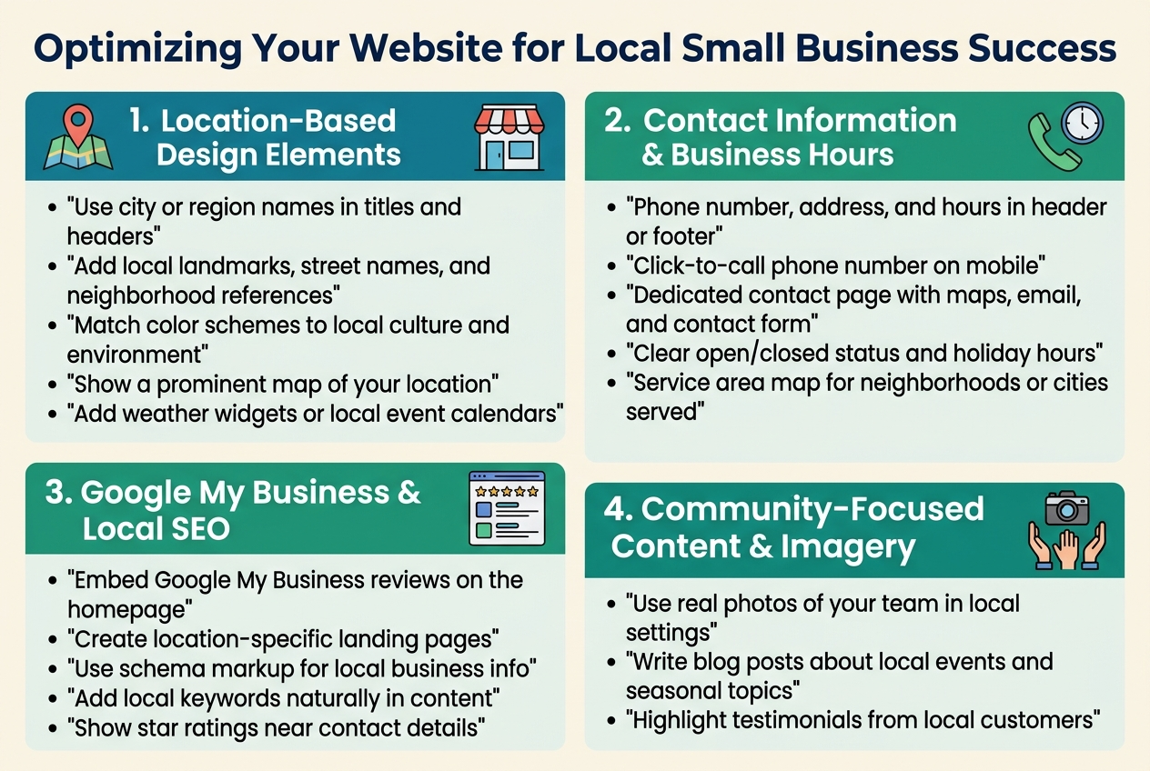
Location-Based Design Elements for Local Appeal
Your website should immediately scream “local business” to visitors from your area. Start by incorporating your city or region name prominently in your page titles, headers, and throughout your content naturally. Use local landmarks, street names, or neighborhood references that resonate with your community.
Color schemes can reflect your local culture too. A beach town business might use coastal blues and sandy beiges, while a mountain town company could embrace earth tones and forest greens. These subtle design choices create an instant connection with local customers who recognize these visual cues.
Include a prominent map showing your location and surrounding area. Interactive maps work especially well because they let visitors explore your neighborhood and see what’s nearby. This helps establish your local presence and makes it easy for customers to find you.
Consider adding weather widgets or local event calendars that automatically update. These dynamic elements show you’re plugged into the local community and keep visitors coming back to check current information.
Contact Information and Business Hours Visibility
Place your phone number, address, and business hours in the header or footer of every page. Many mobile users call businesses directly from search results, so make that phone number large and clickable on mobile devices.
Create a dedicated contact page with multiple ways to reach you:
- Phone number with click-to-call functionality
- Physical address with Google Maps integration
- Email address
- Contact form for non-urgent inquiries
- Social media links
Display your business hours clearly and update them for holidays or special events. Nothing frustrates potential customers more than showing up to a closed business. Consider adding a simple “Currently Open” or “Currently Closed” indicator that updates automatically.
For service-based businesses, include your service area boundaries. A simple map showing which neighborhoods or cities you serve helps qualify leads and sets proper expectations.
Google My Business Integration and Local SEO Design
Embed your Google My Business reviews directly on your website homepage. Fresh, positive reviews build trust and show search engines you’re actively engaging with customers. Display star ratings prominently near your contact information.
Create location-specific landing pages if you serve multiple areas. Each page should target local keywords naturally while providing genuinely useful information about serving that specific community. This approach improves your local search rankings dramatically.
Include schema markup for local business information. This structured data helps search engines understand your business details and can trigger rich snippets in search results, making your listing more attractive to potential customers.
Add location-based keywords throughout your website content, but keep it natural. Instead of stuffing “Denver plumber” everywhere, write about “serving Denver homeowners” or “trusted by Denver families for over 20 years.”
Community-Focused Content and Imagery
Feature real photos of your team working in recognizable local settings. Stock photos feel generic, but images of your staff at the local farmers market or volunteering at community events create authentic connections with local customers.
Write blog content about local events, news, or seasonal topics relevant to your business. A landscaping company might post about preparing gardens for local winter conditions, while a restaurant could feature locally-sourced ingredients from nearby farms.
Highlight customer success stories from your local area. Include specific neighborhood names or local references that other community members will recognize. These case studies serve double duty as social proof and local SEO content.
Partner with other local businesses and feature these relationships on your website. Cross-promotion builds community ties and can lead to valuable backlinks that boost your local search rankings. Display logos of local business partners or community organizations you support.
Create content around local problems your business solves. A pest control company might write about common seasonal pest issues in their specific climate, while a marketing consultant could discuss challenges facing local retail businesses. This targeted content attracts the right local audience and positions you as the go-to expert in your area.
Measuring and Testing Your Website’s Conversion Performance
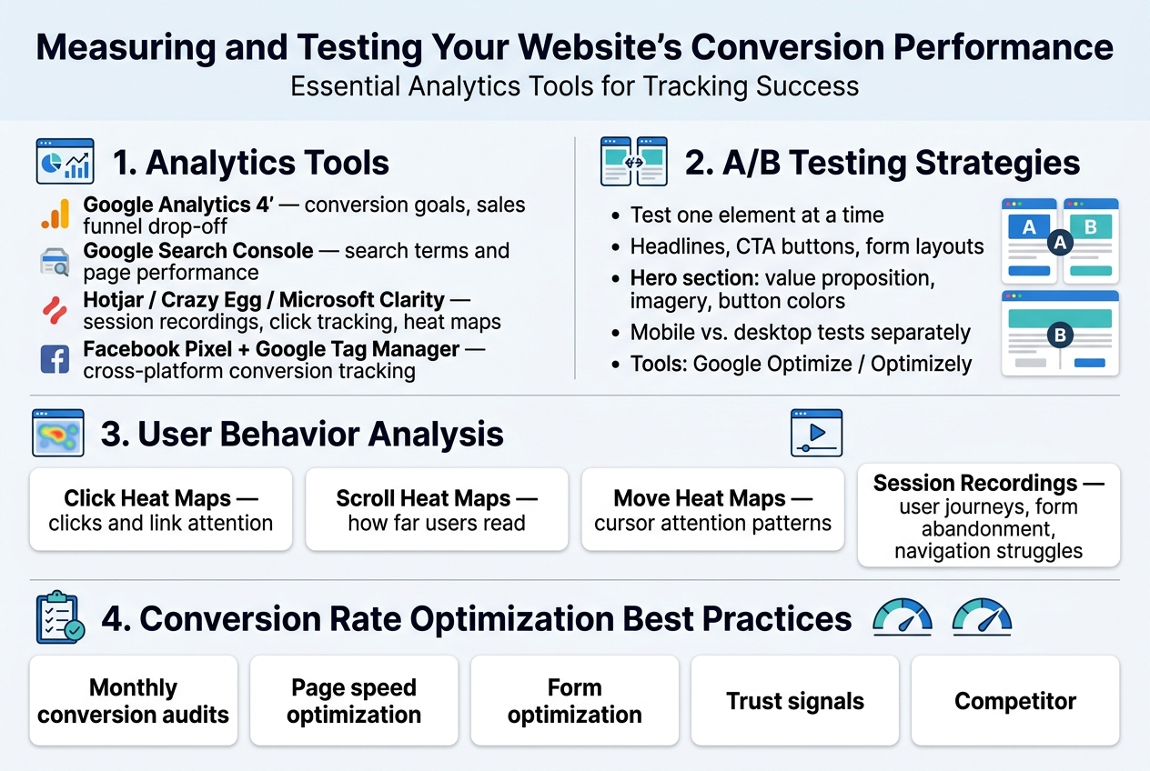
Essential Analytics Tools for Tracking Success
Google Analytics 4 remains the gold standard for tracking website conversion tips and understanding user behavior on your small business website. Set up conversion goals that align with your business objectives – whether that’s form submissions, phone calls, or product purchases. The enhanced ecommerce tracking feature provides deep insights into your sales funnel, showing exactly where visitors drop off.
Google Search Console complements your analytics by revealing which search terms drive traffic to your small business website design. This data helps you understand what content resonates with your audience and which pages need optimization work.
For small business web design 2026, consider tools like Hotjar or Crazy Egg for visual analytics. These platforms show you exactly how visitors interact with your pages through session recordings and click tracking. Microsoft Clarity offers similar functionality for free, making it perfect for budget-conscious small businesses.
Facebook Pixel and Google Tag Manager help track conversions across multiple platforms, giving you a complete picture of your customer journey. These tools become essential when running paid advertising campaigns to support your conversion-focused design efforts.
A/B Testing Strategies for Design Improvements
A/B testing turns guesswork into data-driven decisions for your website design that converts. Start with high-impact elements like headlines, call-to-action buttons, and form layouts. Testing one element at a time ensures you can identify what specifically drives improvement.
Your homepage hero section deserves priority testing attention. Try different value propositions, imagery, and button colors. Even small changes like switching from “Get Started” to “Start Your Free Trial” can dramatically impact conversion rates.
Landing page design elements to test include:
- Headlines and subheadings
- Button colors and text
- Form field requirements
- Social proof placement
- Image vs. video backgrounds
- Pricing presentation formats
Use tools like Google Optimize (free) or Optimizely (paid) to run these tests. Ensure statistical significance before making permanent changes – typically requiring at least 1,000 visitors per variation and running tests for complete business cycles.
Split test your mobile vs. desktop experiences separately, as user behavior differs significantly between devices. Mobile users often prefer simpler forms and larger buttons, while desktop users may engage with more detailed content.
User Behavior Analysis and Heat Mapping
Heat mapping reveals the invisible patterns of how visitors actually use your professional website design for conversions. These visual representations show where users click, scroll, and spend the most time on your pages.
Click heat maps highlight which buttons and links attract attention, helping you optimize your navigation and call-to-action placement. If users consistently click on non-clickable elements, consider making them functional or removing the confusion.
Scroll heat maps show how far down your pages visitors typically read. This data helps you place important conversion elements above the fold while identifying content that might be better positioned higher on the page.
Move heat maps track cursor movement, providing insights into user attention patterns. Areas where cursors linger often indicate points of interest or confusion that warrant closer examination.
Session recordings take this analysis deeper, showing complete user journeys through your site. Watch for common patterns like form abandonment points, navigation struggles, or pages where visitors seem lost. These insights directly inform your conversion rate optimization strategy.
Conversion Rate Optimization Best Practices
Regular conversion audits keep your small business website design performing at its peak. Monthly reviews of your analytics data help identify trends and opportunities for improvement. Look for pages with high traffic but low conversion rates – these represent your biggest optimization opportunities.
Create a systematic testing calendar rather than random experiments. Focus on pages that drive the most business value first, then work down to supporting pages. Document every test result, including failures, to build institutional knowledge about what works for your specific audience.
Page speed optimization directly impacts conversions, with even one-second delays causing significant drop-offs. Use Google PageSpeed Insights to identify technical improvements, and consider implementing Accelerated Mobile Pages (AMP) for content-heavy pages.
Form optimization deserves special attention in your how to increase website conversions strategy. Reduce fields to absolute essentials, use smart defaults, and implement real-time validation to catch errors before submission. Multi-step forms often convert better than long single-page versions for complex purchases.
Trust signals become increasingly important for conversion optimization. Display security badges, customer testimonials, and contact information prominently. Local businesses should emphasize their community presence and local expertise to build credibility with nearby customers.
Regular competitor analysis keeps your optimization efforts competitive. Study successful businesses in your industry to identify design trends and conversion tactics worth testing on your own site.
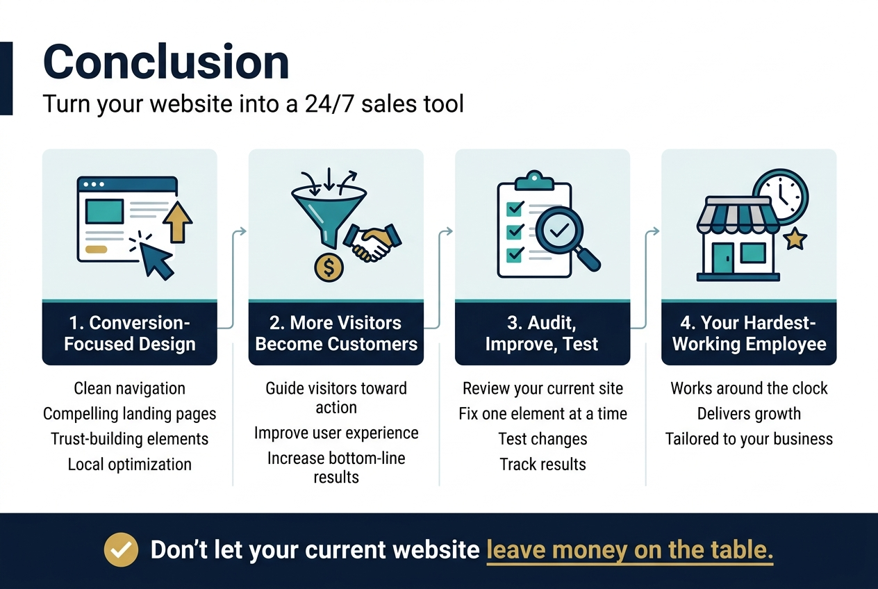
Your website’s success depends on how well it guides visitors toward taking action. The fundamentals we’ve covered – from clean navigation and compelling landing pages to trust-building elements and local optimization – work together to create an experience that turns casual browsers into paying customers. Remember that professional design isn’t just about looking good; it’s about making every element serve a purpose in moving visitors through your conversion funnel.
Don’t try to implement everything at once. Start with the most impactful changes like improving your site speed, adding clear calls-to-action, and ensuring your contact information is easy to find. Then gradually test and refine other elements based on what your analytics tell you. Your website is never truly finished – it’s a living tool that should evolve with your business and customer needs. Set aside time each month to review your conversion data and make small improvements that can lead to big results over time.